More
Сhoose
Consistent.
Strategic.
Recognizable.
Corporate Branding
Simplicity, Elegance, Innovation!
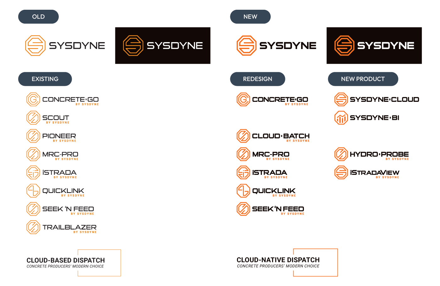
At Sysdyne, led a comprehensive brand refresh initiative focused on modernizing the visual identity and improving brand consistency across all platforms.
Logo Modernization
- Revitalized the company's primary logo: Introduced a bold, modern design with a more vibrant Pantone® Orange, creating a contemporary aesthetic that enhances visual impact while preserving the core brand identity.
- Implemented updated design principles: Applied the refreshed design across the entire product suite, refining existing product logos and developing new ones to ensure a cohesive and unified brand presence.
- Enhanced brand resonance: Achieved a consistent visual identity that connects with clients and stakeholders, strengthening overall market appeal.
Logo Modernization
2022-2024
Branding Style Guide Development
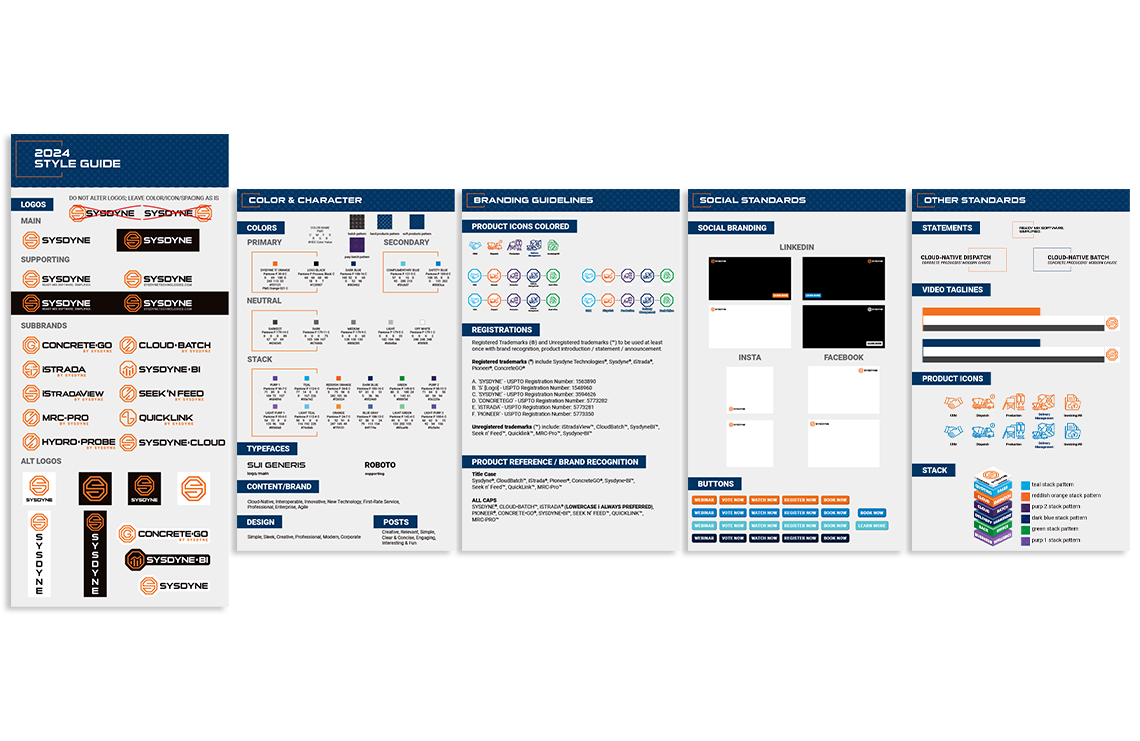
- Crafted a visually compelling branding style guide: Developed an in-depth resource to establish a unified approach to all visual and verbal communications.
- Included detailed specifications: Documented guidelines for logo usage, color palette, typography, tone of voice, design principles, social media templates, video branding, product iconography, trademark protocols, and product reference standards.
- Ensured brand consistency: Provided a comprehensive tool to maintain cohesive representation, enhance recognition, and uphold brand integrity across all channels and touchpoints.
Brand Guidelines
2023-2024
Business Card Redesign
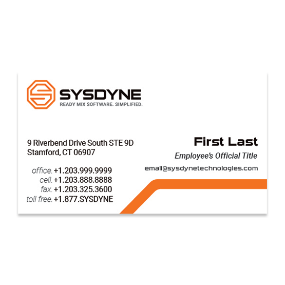
- Modernized business card design: Incorporated the updated logo and refreshed brand colors to create a sleek and professional appearance.
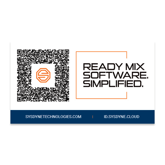
- Introduced a double-sided layout: Added a QR code on the back for seamless vCard contact exchange, enhancing convenience and engagement opportunities.
Business Card Redesign
2019-2024
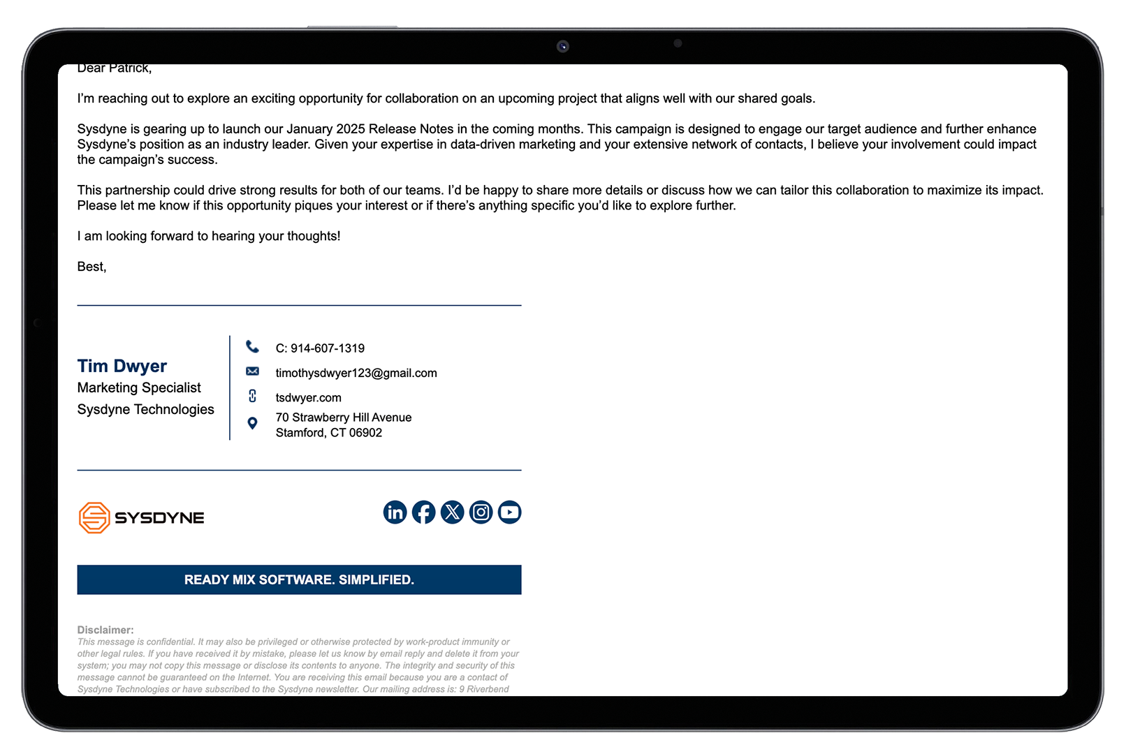
Email Signature Standardization
- Designed a professional HTML email signature: Created a template aligned with the refreshed brand guidelines for consistent and polished communication.
- Personalized for each employee: Customized signatures for individual employees and organized them in a shared company folder for easy access.
- Developed a tutorial video: Produced a step-by-step guide to help employees install the HTML email signature in Gmail, ensuring a seamless setup process and maintaining brand consistency.
Email Signature Standardization
2019-2024
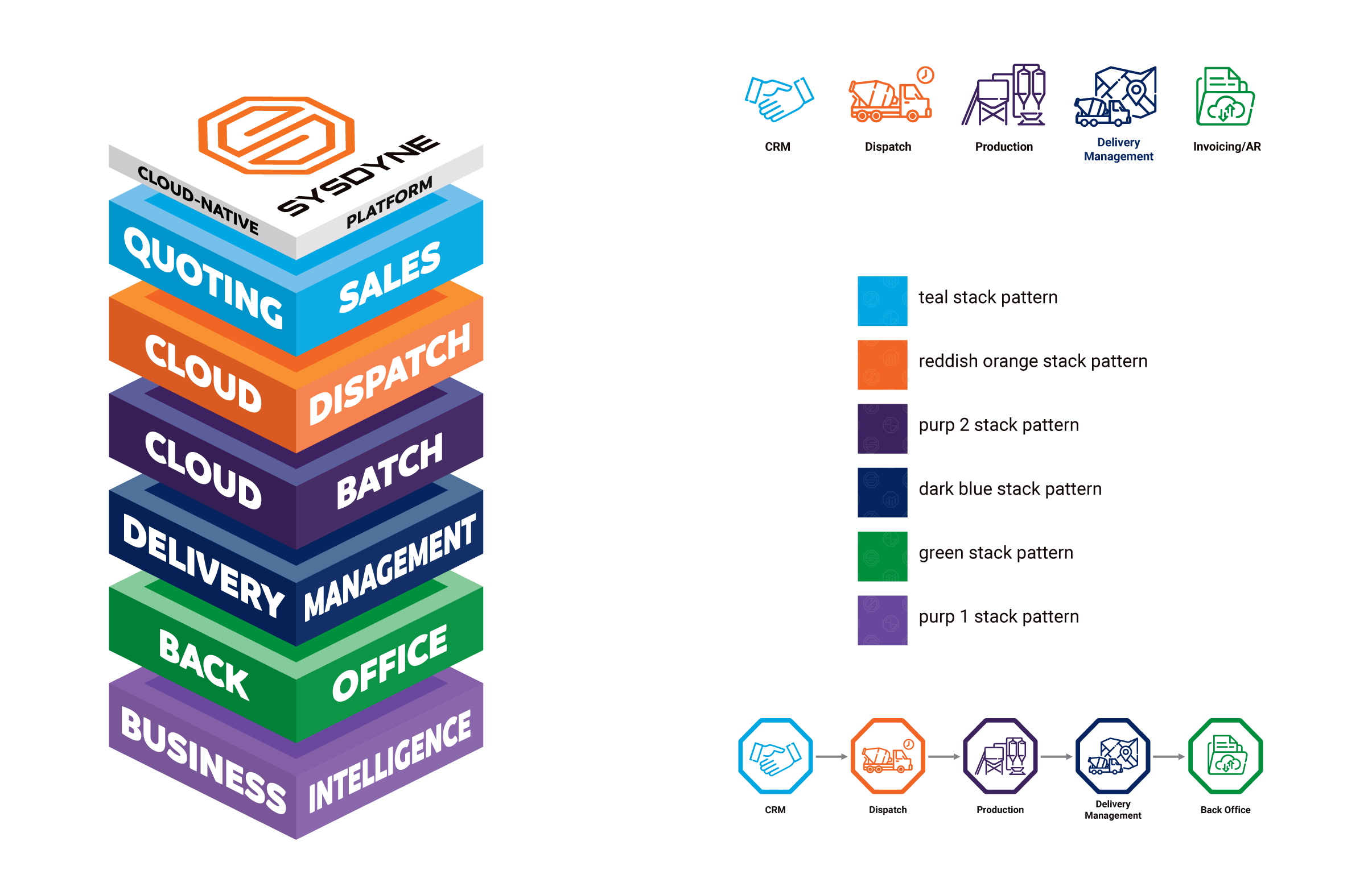
Solutions Stack Visualization
- Designed an innovative solutions stack graphic: Visually represented Sysdyne's comprehensive offerings in a unified and intuitive platform.
- Enhanced clarity and market appeal: Highlighted the synergy between solutions through a visually compelling and cohesive design.
- Developed an engaging animation video: Produced a dynamic animation of the solutions stack to illustrate its functionality and value, accessible via this link.
Horizontal Icon Design
- Created a versatile horizontal icon: Designed a horizontal version of the solutions stack to ensure adaptability across various media formats and applications.
- Maintained visual impact: Ensured the design retained its effectiveness and aligned with brand consistency for both digital and print platforms.
Solutions Stack Visualization & Horizontal Icon Design
2023-2024
